Ripio
Crypto's biggest problem was never the technology.
It was trust.
- Role
- Lead Product Designer
- Timeline
- Oct 2018 – Mar 2019
- Team
- Me (lead), 1 Product Designer, 1 Project Manager
- Tools
- Sketch, InVision, Mural, Whimsical
Problem
Crypto could help Argentinians protect their savings, but nobody had made it easy to use or to trust.
What I did
Led design end to end for 6 months. Rebuilt the web wallet, onboarding, credits, catalog and marketplace, plus the UI kit behind them.
Outcome
Everything shipped.
01 — Overview
Overview
Project summary
Team
Me (lead), 1 Product Designer, 1 Project Manager
Duration
6 months
Deliverables
Discovery definitions, UX architecture, hi-fi prototypes, motion & illustrations
Project type
Product discovery · Product design
Applied methodologies
Competitive benchmarking, user & product discovery, user interviews, usability testing, low-fi & high-fi prototyping
This didn't start as a redesign. It started as a one-month discovery to prototype a small MVP. But discovery showed that a wallet disconnected from everything else wouldn't solve the real problem. Ripio needed a connected ecosystem, not just a better wallet. We made the case, Ripio agreed, and the project grew into rebuilding the entire web wallet: every transactional flow, onboarding and identity verification, credits, the crypto catalog and marketplace, and the UI kit it all ran on.
My role
I led the design end to end, from discovery to final UI. I ran the process, designed every flow in this case study, and facilitated workshops with Ripio's CEO to define the personas, prioritize the flows and make the key product decisions together.
02 — The Product
The Product
In Argentina, with constant inflation, crypto was a real way for ordinary people to protect their savings. But nobody was solving the obvious problem: most people had no idea how to use it. Digital wallets were still new, and people didn't trust them. The bar we set was simple: using Ripio should feel as familiar as using your home banking.
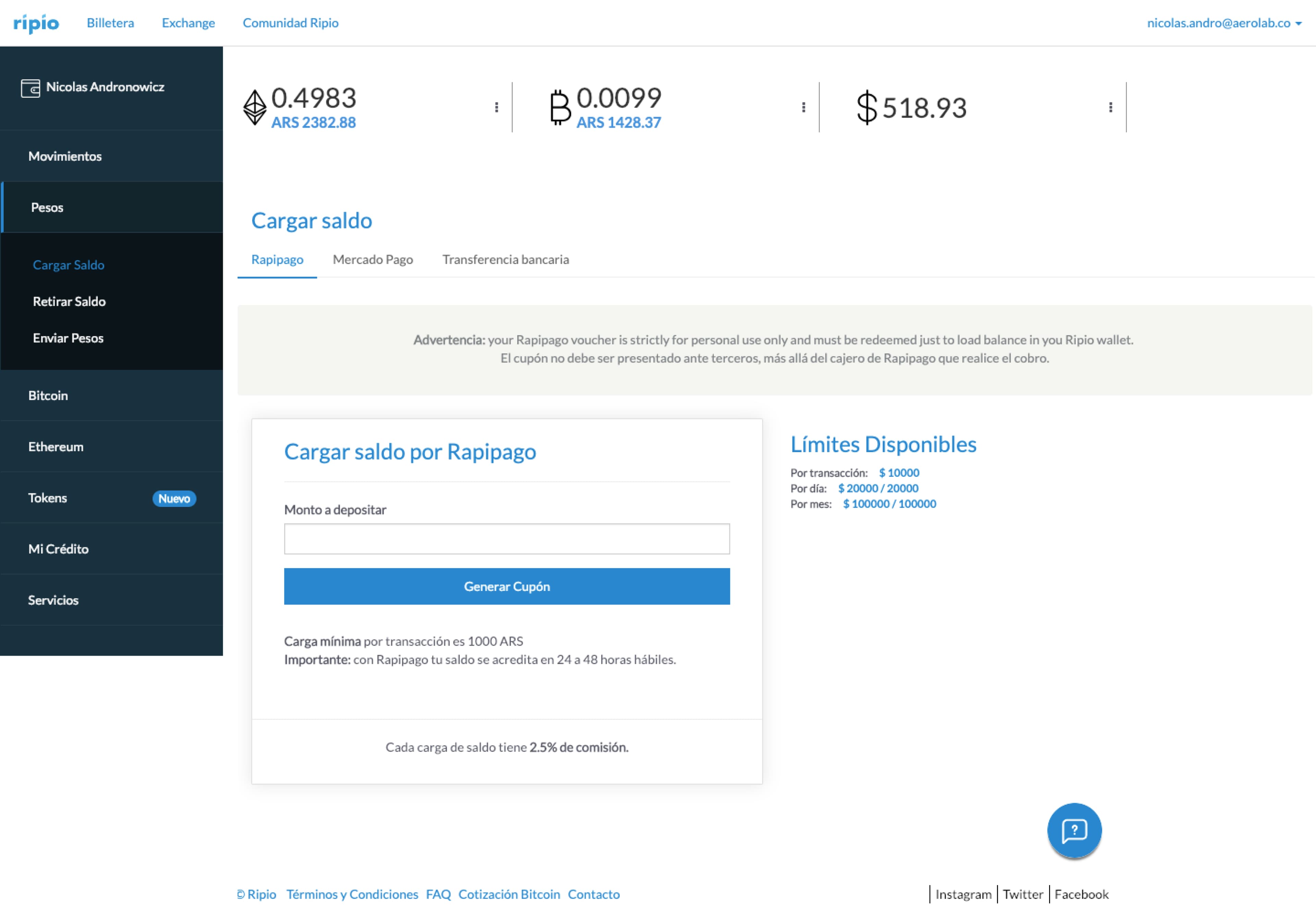
The problem wasn't a lack of features. Buying, selling, credits, services, exchange: it was all there. But nothing told people what to do first, each section worked on its own, and the whole experience assumed you already understood crypto. For the people Ripio wanted to reach, that was the real barrier. Not the technology, but trusting something they didn't understand.
03 — Goals
Goals
Business goals
- Gain new users
- Innovate ahead of competitors
- Increase loyalty of current users
Product goals
“Make Ripio the link between people and cryptocurrencies”
- Democratize access to knowledge
- Provide information in a targeted manner
- Offer relevant functionality for each user segment
04 — Users
Users
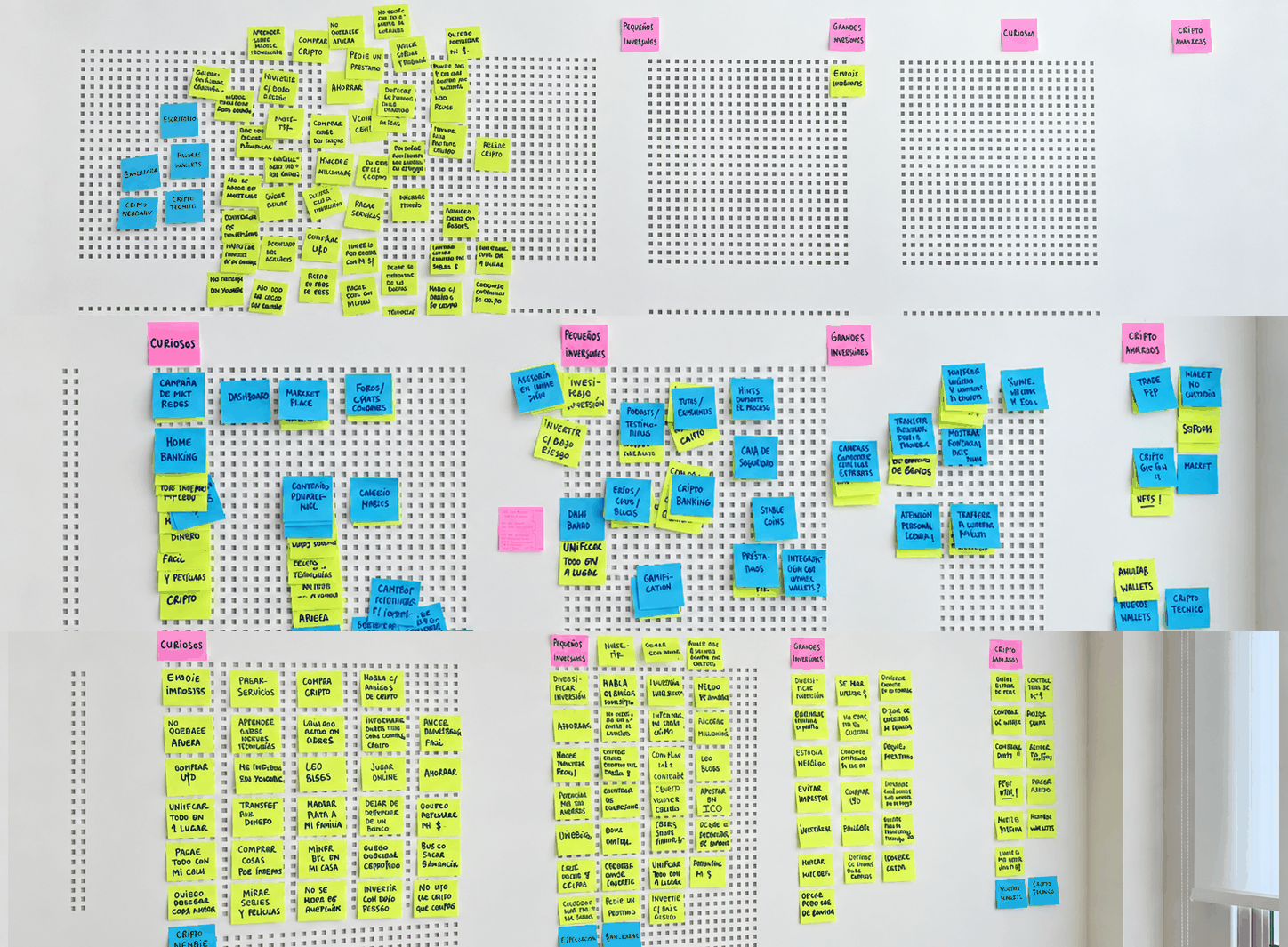
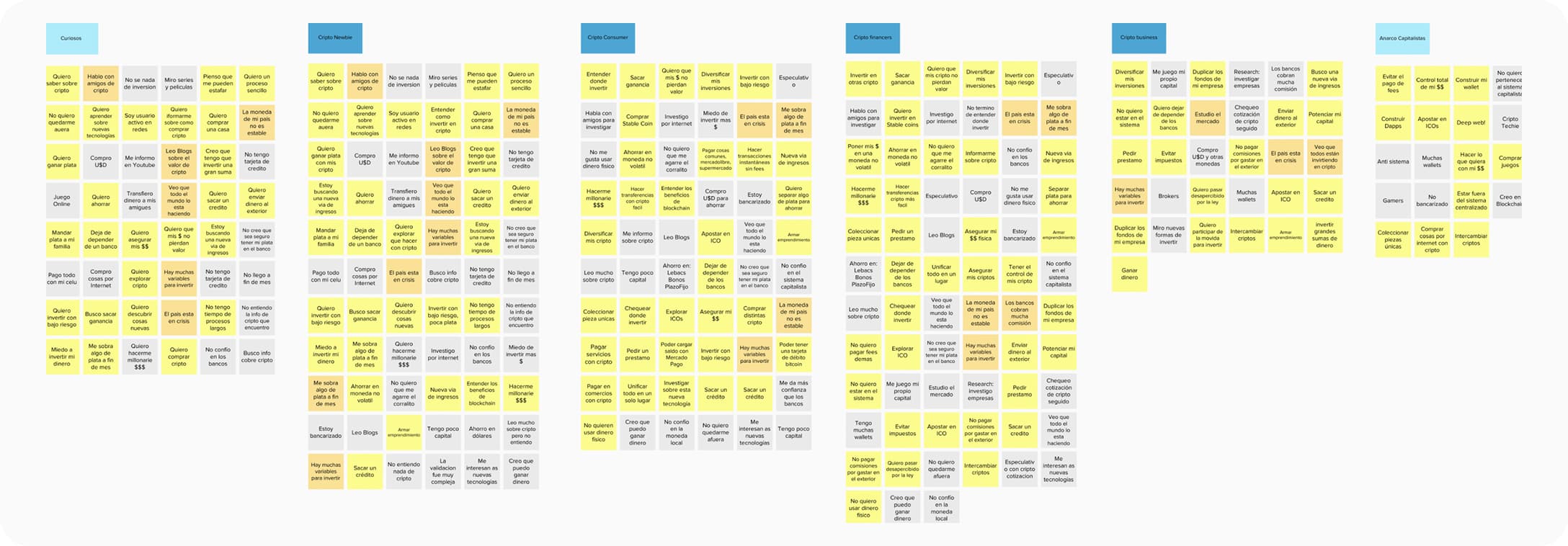
We segmented users with Jobs to Be Done, crossing three parameters: motivation for money transactions, type of crypto transactions, and level of crypto knowledge.
Proto-personas
Phase 01
Newbies
Get familiar with the product
Consumers
Perform daily actions
Financers
Make small investments
Phase 02
Curious
Be able to capture them
Business negotiators
Make great investments
Phase 03
Anarcho-Capitalist
Have autonomy
What we discovered
People shouldn't have to become crypto experts to reach their goals. Our job was to shorten the learning curve and lower the cognitive effort at every step.
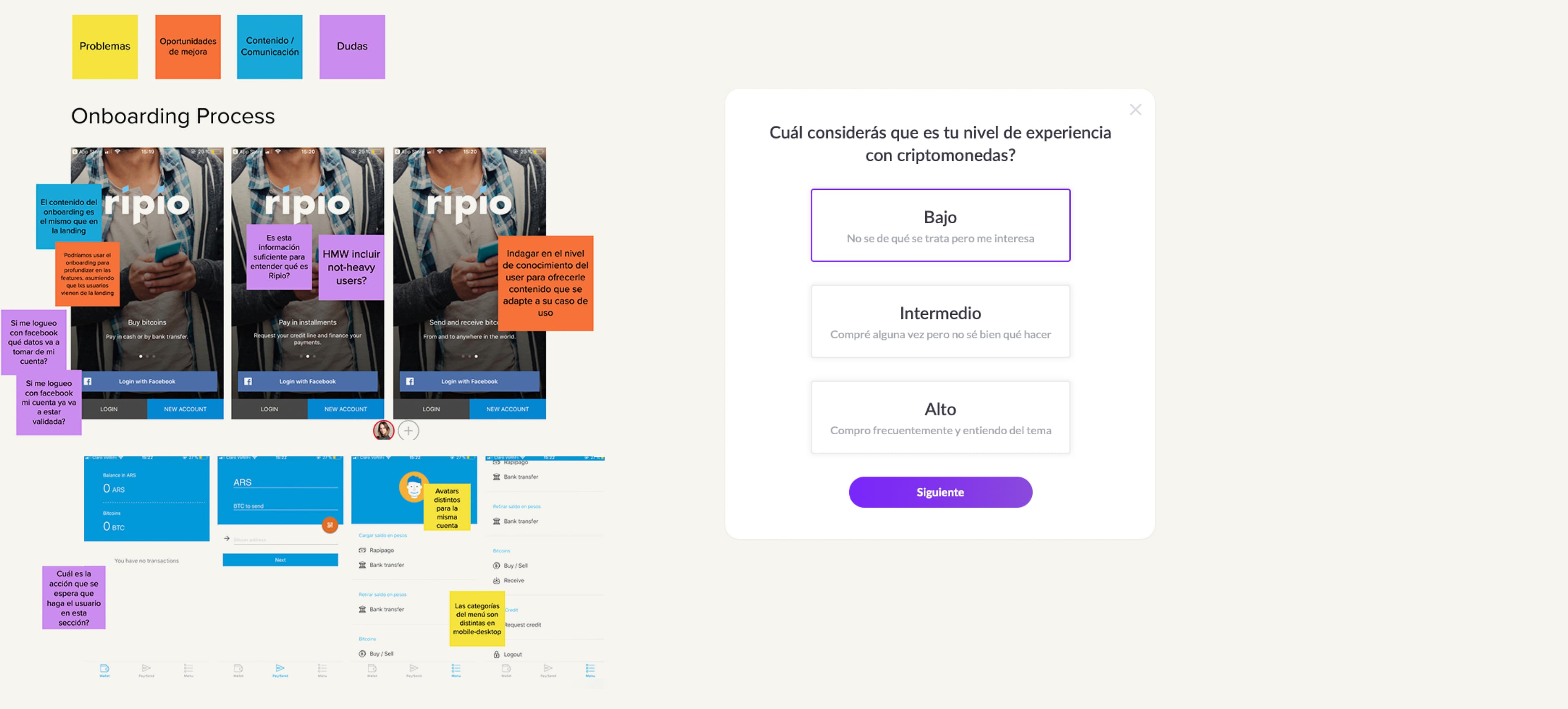
The MVP focused on phase 1: Newbies, Consumers and Financers. The more expert profiles came in later phases. The self-rated knowledge question (low, intermediate, high) became part of onboarding, so the product could adapt to each level from the first session.
The personas also shaped the roadmap. Each part of the ecosystem was built for a different profile: buying and saving crypto for Newbies and Consumers, the core of the MVP. Credits for Financers, offering something many people couldn't get from a regular bank. And the marketplace for the niche that already used crypto wallets, like the Curious and the Anarcho-capitalists. That's why the marketplace came later. It mattered, but it wasn't the main focus.
05 — Process / Discovery
Process / Discovery
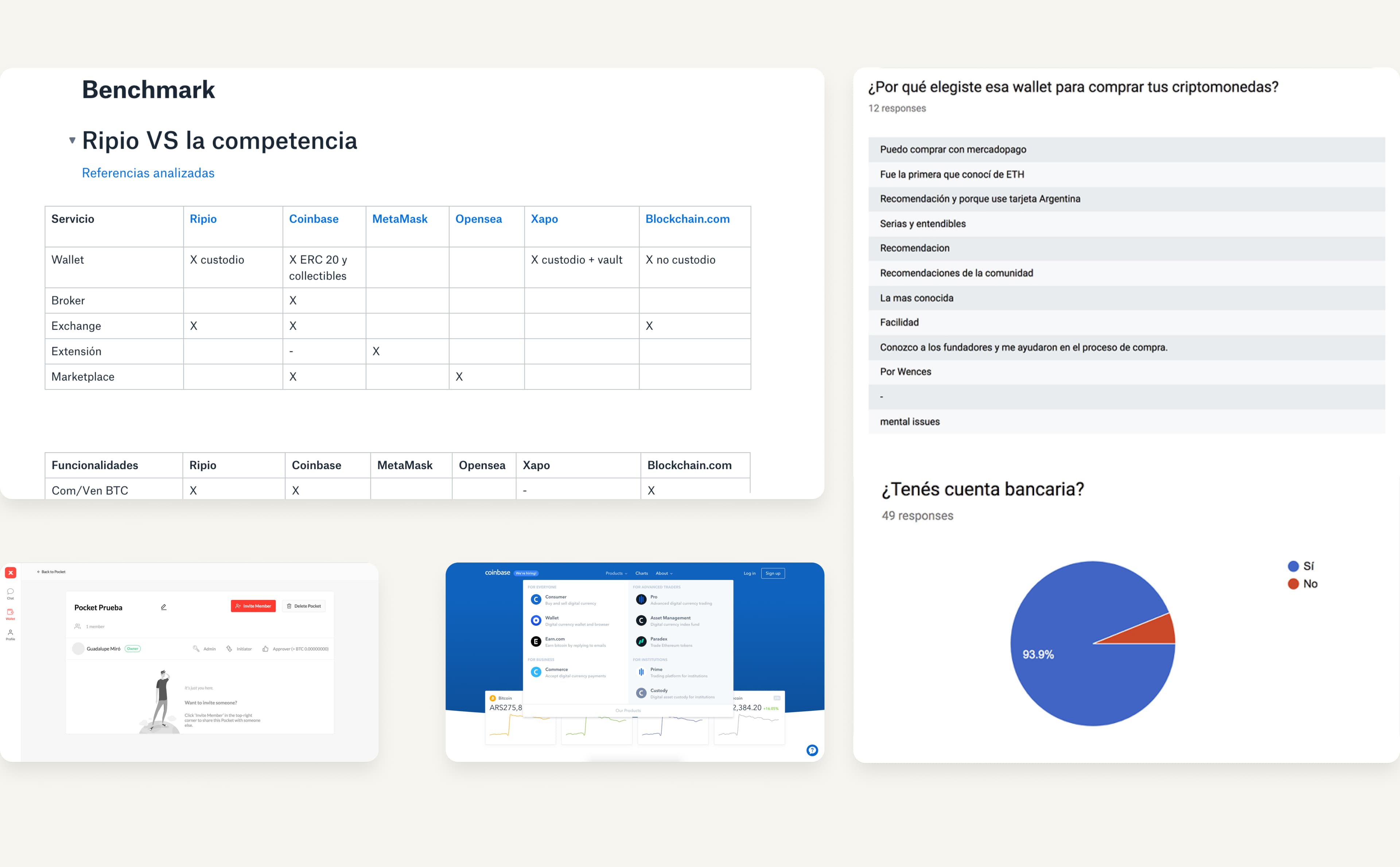
We started with an audit of the wallet and community, looking at primary actions, onboarding, cross-device navigation and architecture. We also benchmarked competitors like Xapo, which targeted specific products at specific segments and translated familiar money habits into digital ones.
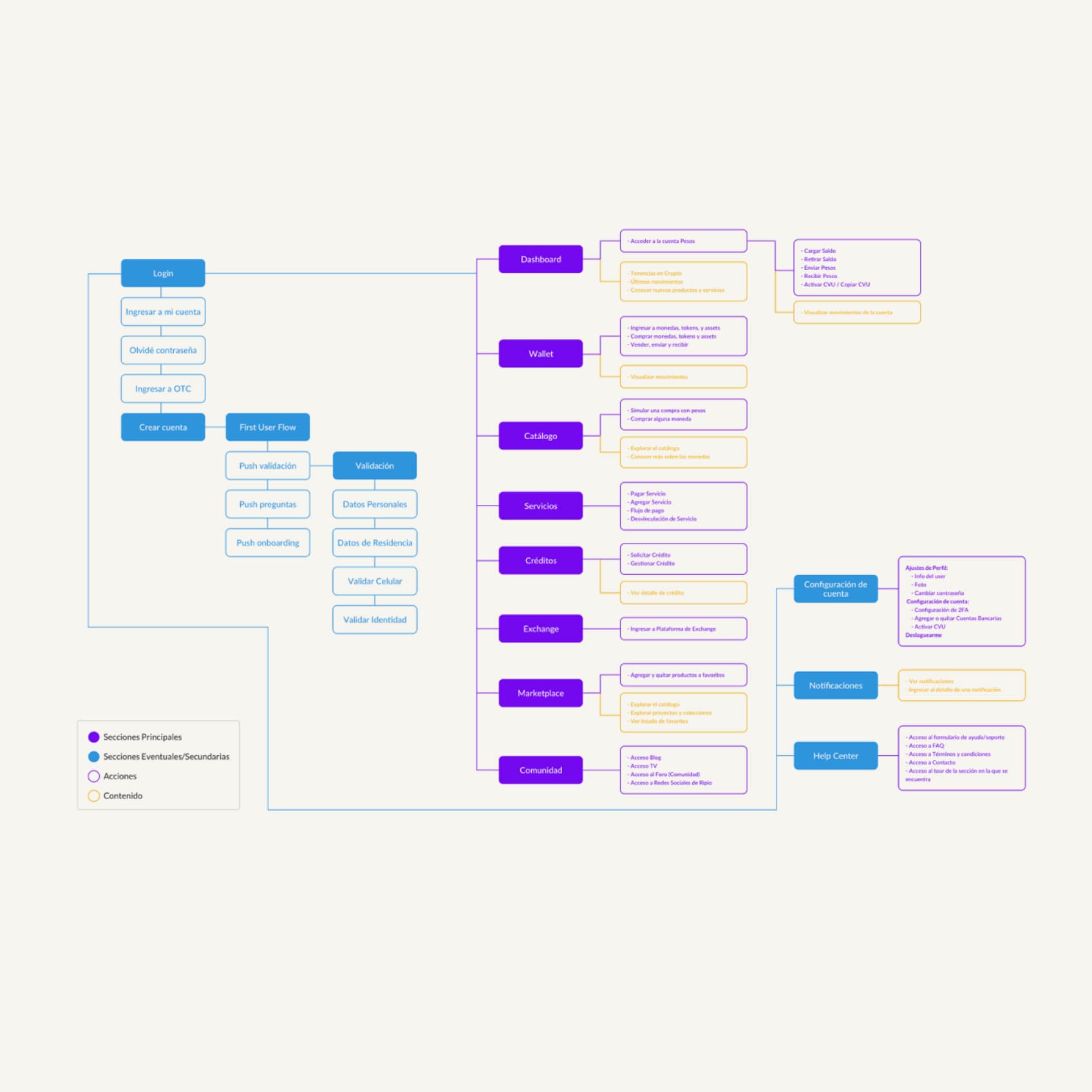
We rebuilt the information architecture from scratch, mapping every section for users with and without an account, so the product logic was clear before any screen was drawn.
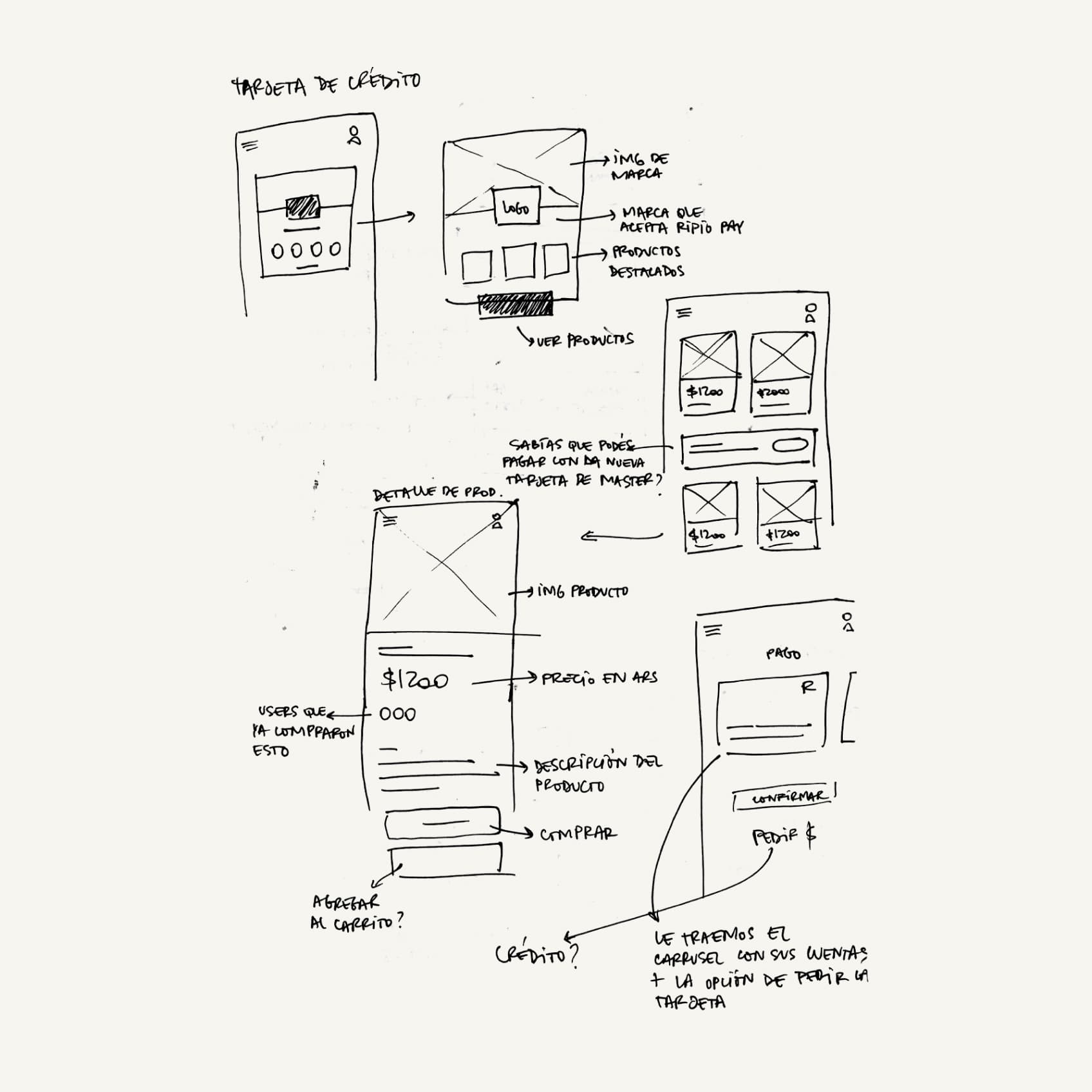
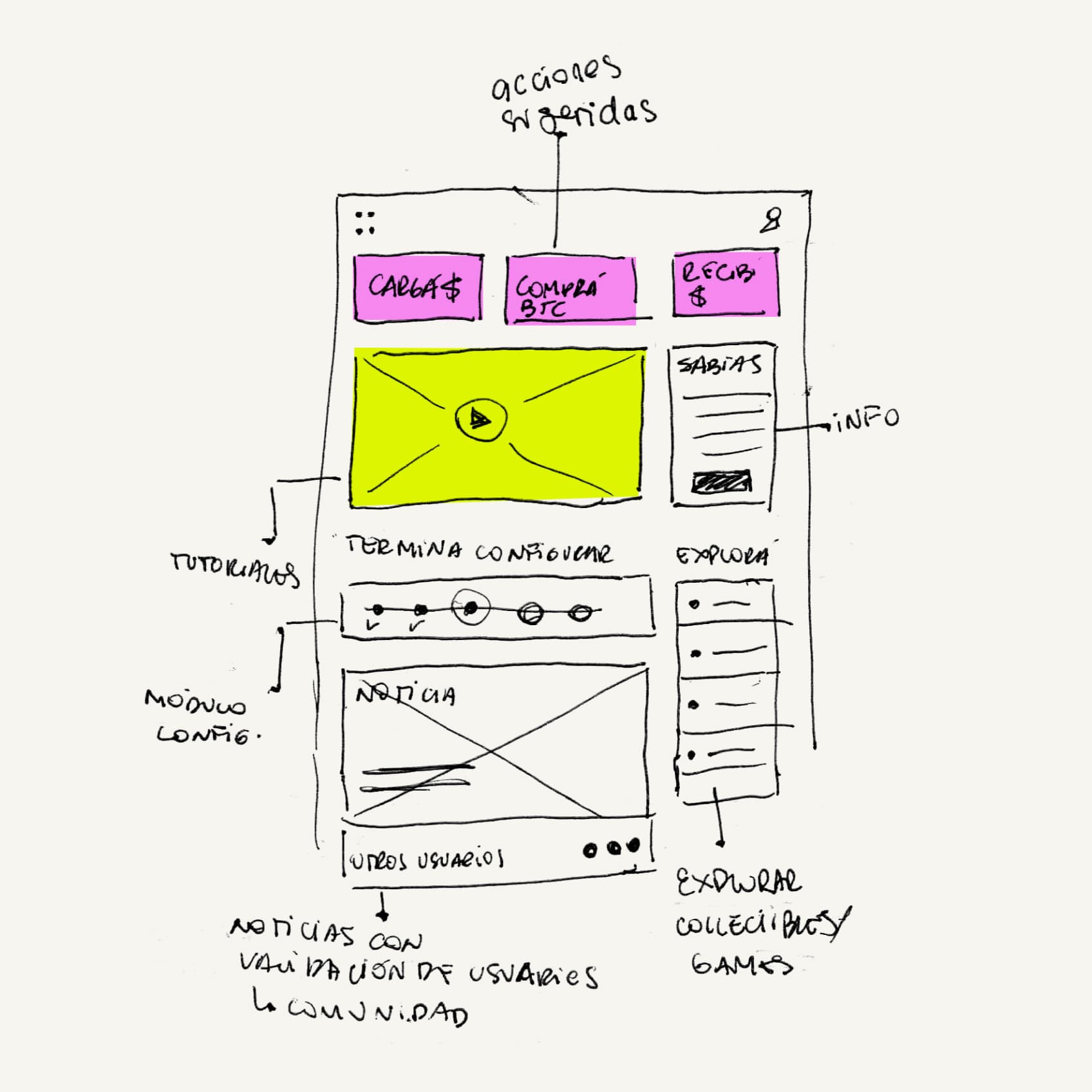
From there we sketched the key screens by hand, moved to lo-fi wireframes to test the flows, and only then went to high fidelity.
What testing showed
People didn't know how to load crypto, where to load it from, or even why they would. The new flows answer those three questions up front, and when we tested them with users, they found them clearly easier to use.
Three principles
- Integral: every Ripio product in one place, organically and with sense.
- Flexible: a modular design system that adapts to different platforms and products.
- Scalable: a permeable structure that lets the product grow at different levels.
06 — What We Built
What We Built
Site navigation
Architecture and sitemap rework for logged in/out users.
Login / Signup / Validation
New UX for higher conversion.
Wallet
Complete core refactor.
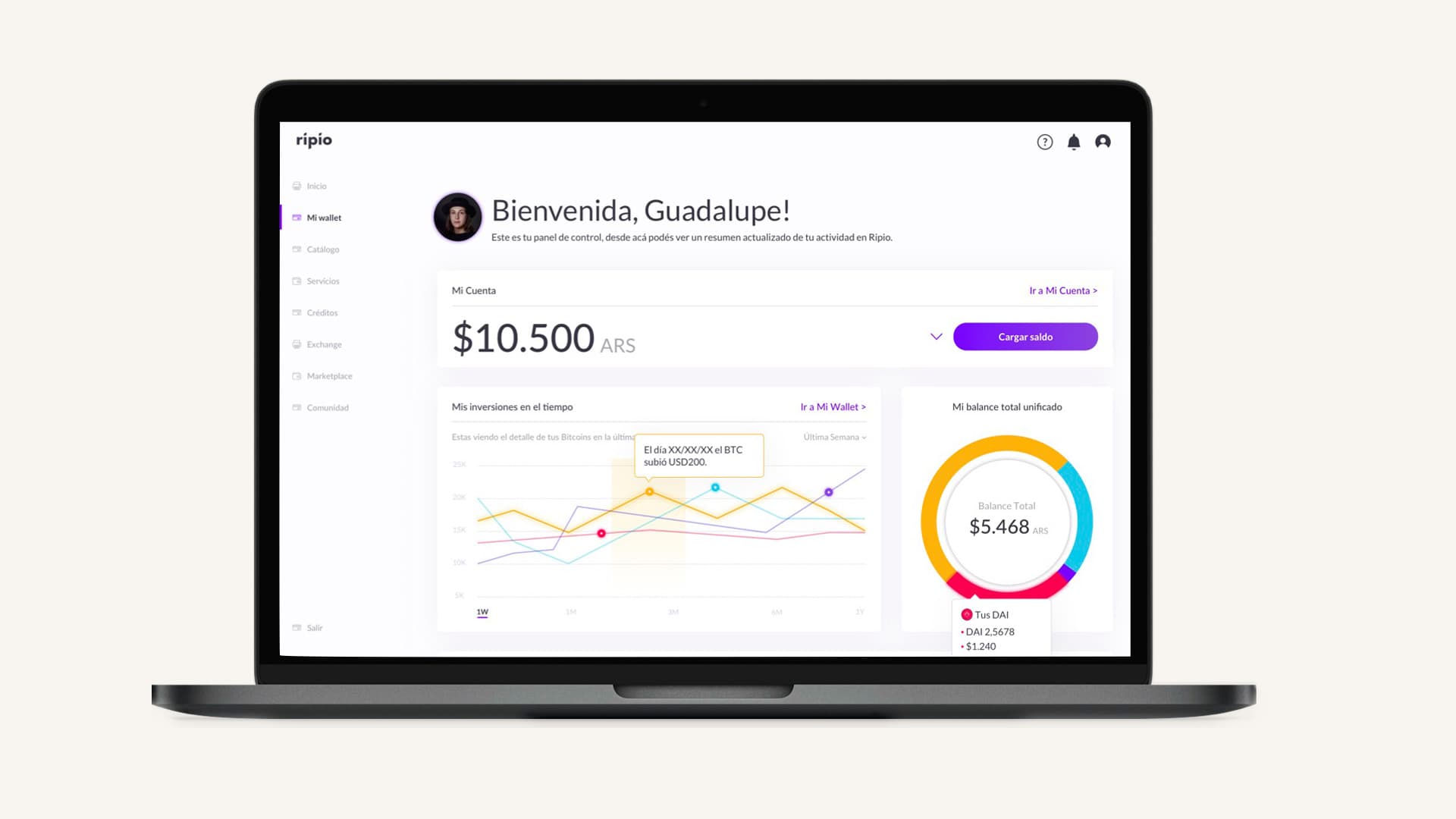
Dashboard
Portal to the crypto world.
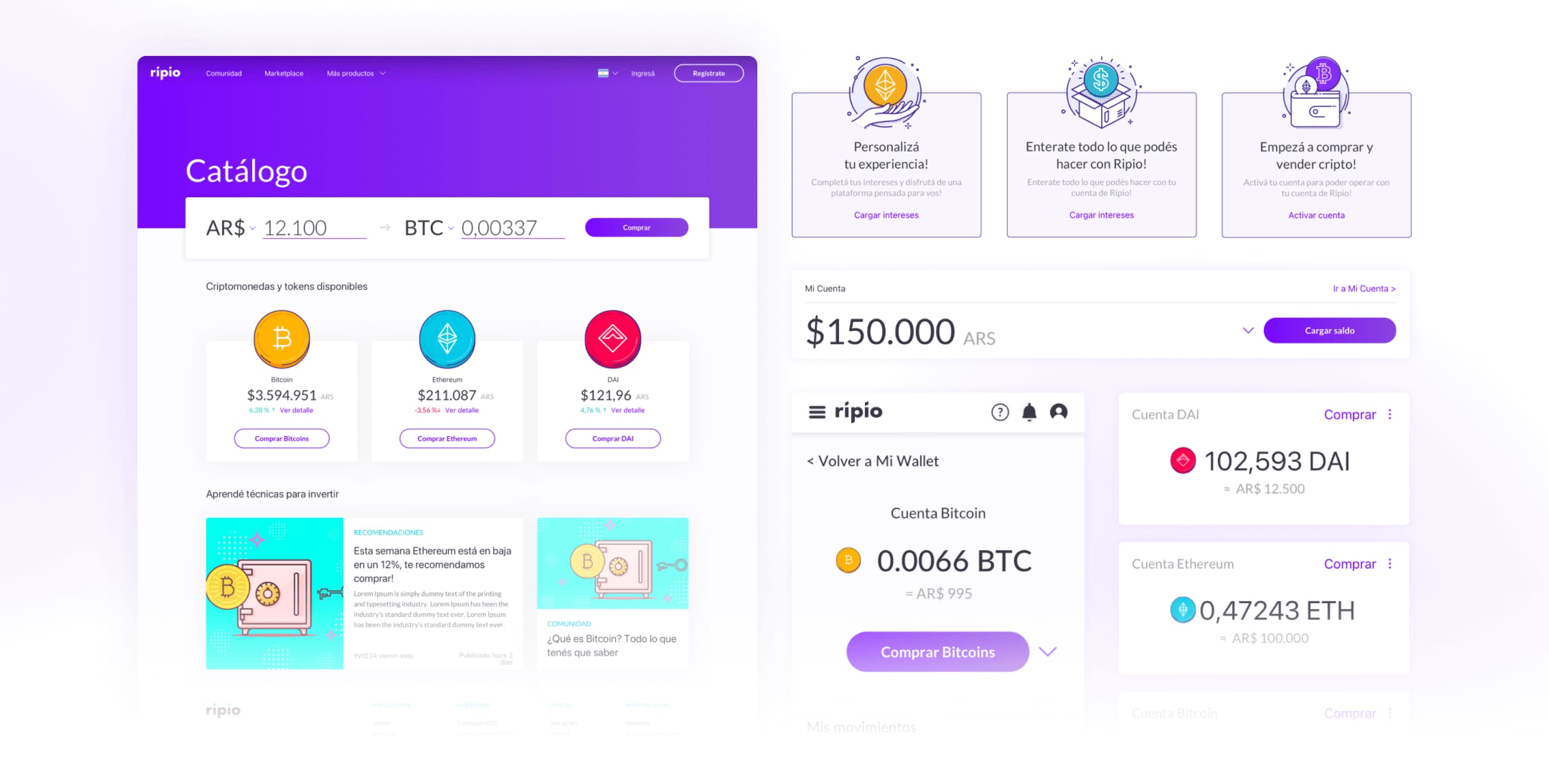
Crypto catalog
Discovery section per currency.
Crypto landing
Currency-specific landing pages.
Ripio credit redesign
New request-and-manage flow.
Marketplace / Discovery
Buy/sell collectibles in pesos.
07 — Featured Flows
Featured Flows
Wallet + Dashboard
The core rebuild
One clear home for pesos and crypto holdings. Every transactional flow: buy, sell, cash in, cash out, followed the same one-step-at-a-time logic.
- Access / buy / sell / send / receive each asset
- View movements and status at a glance
- Discover new products relevant to each user's profile
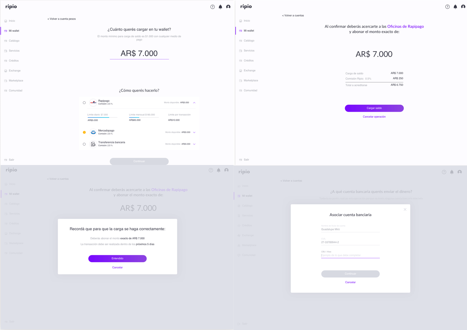
Cash in. Amount first, then method, with fees and limits visible before you commit.
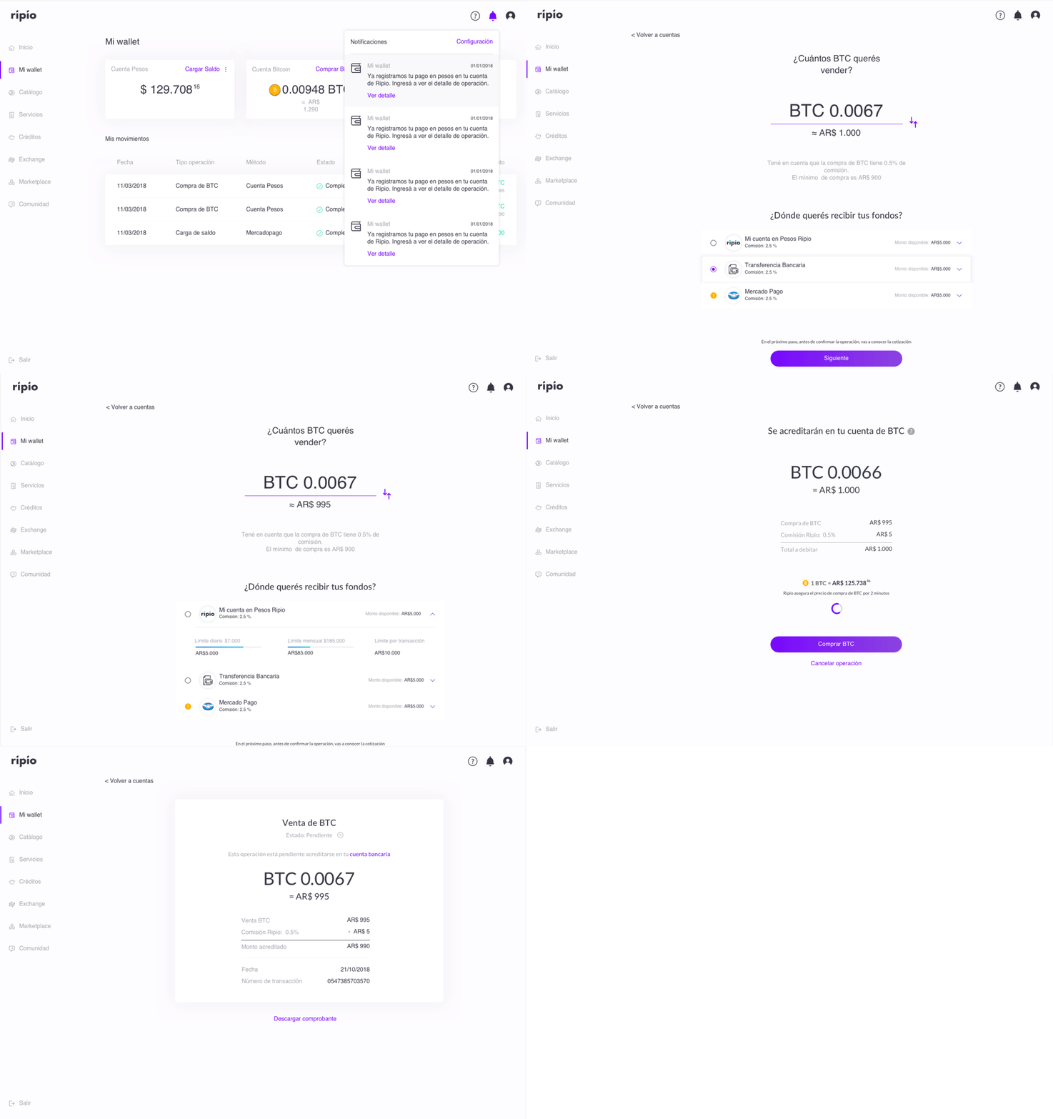
Selling BTC. From the wallet to amount, destination and receipt.
Key decisions
- One step, one action at a time, to reduce cognitive load
- Price and full breakdown shown before confirming, so there are no surprises
- Every CTA says what happens next
- Fees and limits visible before choosing a payment method
- Payment methods as expandable cards, so new ones can be added without redesigning the flow
Onboarding + Validation
The trust arc
Get a first-time user through account validation and a welcome tour without scaring them off.
- Validate account to start trading
- Learn platform via welcome tour
- Enter personal info → residence → phone → ID, one step at a time
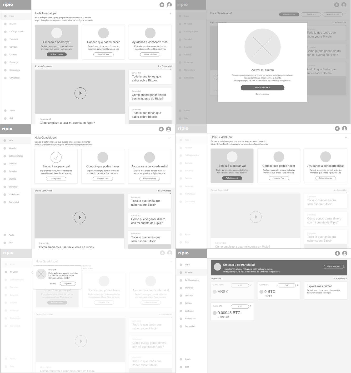
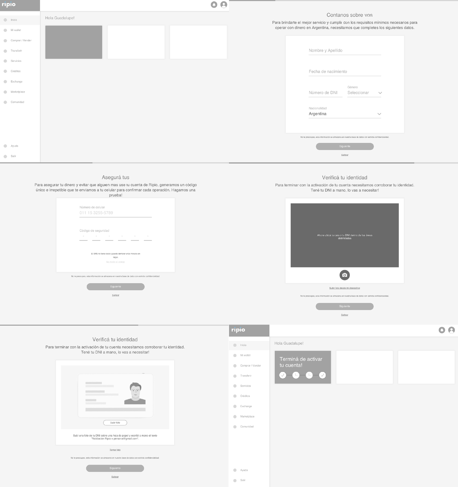
Lo-fi prototype. Account activation and phone validation with a one-time code.
Key decisions
- Validation split into four short steps, so no single screen asks too much
- A knowledge questionnaire up front, so the experience adapts to each user
- A welcome tour that teaches by showing the priority actions
Marketplace
The differentiator
A new space to discover, buy and sell non-fungible collectibles directly in pesos.
- Explore catalog and collections
- Add / remove favorites
- See each collectible's bio, owner, price and details, then share it or add it to a wishlist
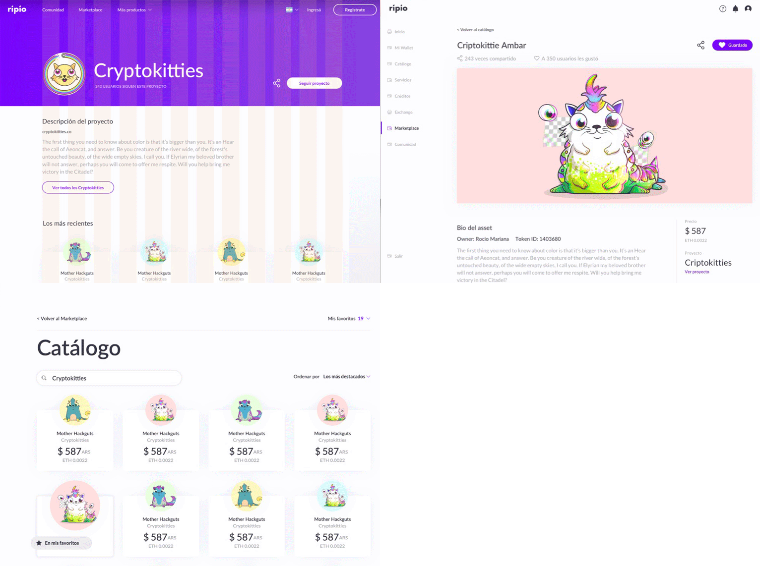
Browsing collections like Cryptokitties, with price and owner at a glance.
Ripio wanted to offer crypto products beyond coins: assets, collectible tokens, and whatever came next. The marketplace gave them a home, where people could discover, buy and sell them directly in pesos. It was built for a different audience: people who already used crypto wallets. A niche, but a way to reach users that a wallet made for ordinary people wouldn't attract on its own.
Key decisions
- The main action is always visible, on every screen
- Each collectible gets its own page: bio, owner, price and details
- Favorites and sharing, to turn browsing into coming back
Ripio Credits
The transparency test
Make a credit easy to take and impossible to lose track of.
For many people in Argentina, getting a credit from a traditional bank wasn't an option. Ripio offered one online, which made it a strong way into the whole platform.
- Scoring assigns either a personal loan or a micro-credit. Users don't choose the type or the amount
- Pre-approved line with a slider, and installment options compared side by side
- Once active: available amount, status, history and movements in one place
- Clear alerts for upcoming and overdue installments
Since users couldn't choose the product, the design had to earn their trust by being completely clear about everything else.
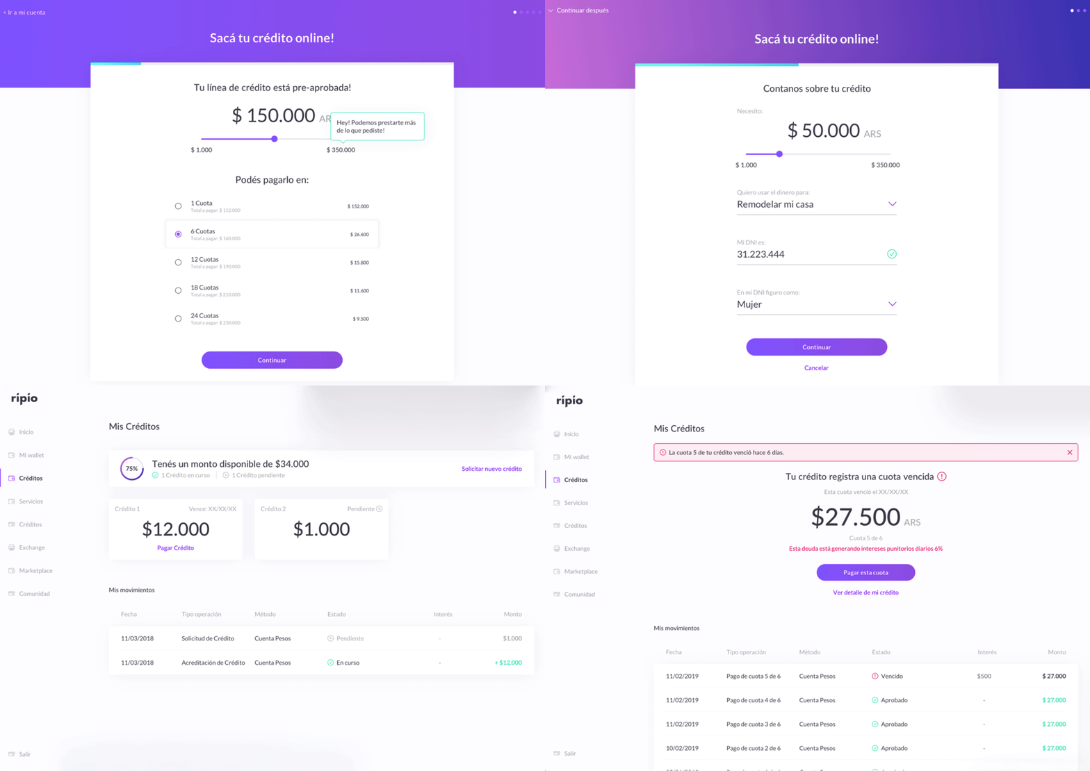
Requesting a pre-approved credit, then managing it, including overdue alerts.
Key decisions
- A short, transparent request form with few actions at a time
- Payment and financing options compared side by side before committing
- Due-date alerts with the amount and the main action right there
08 — Design System
Design System
Everything above ran on the same system.
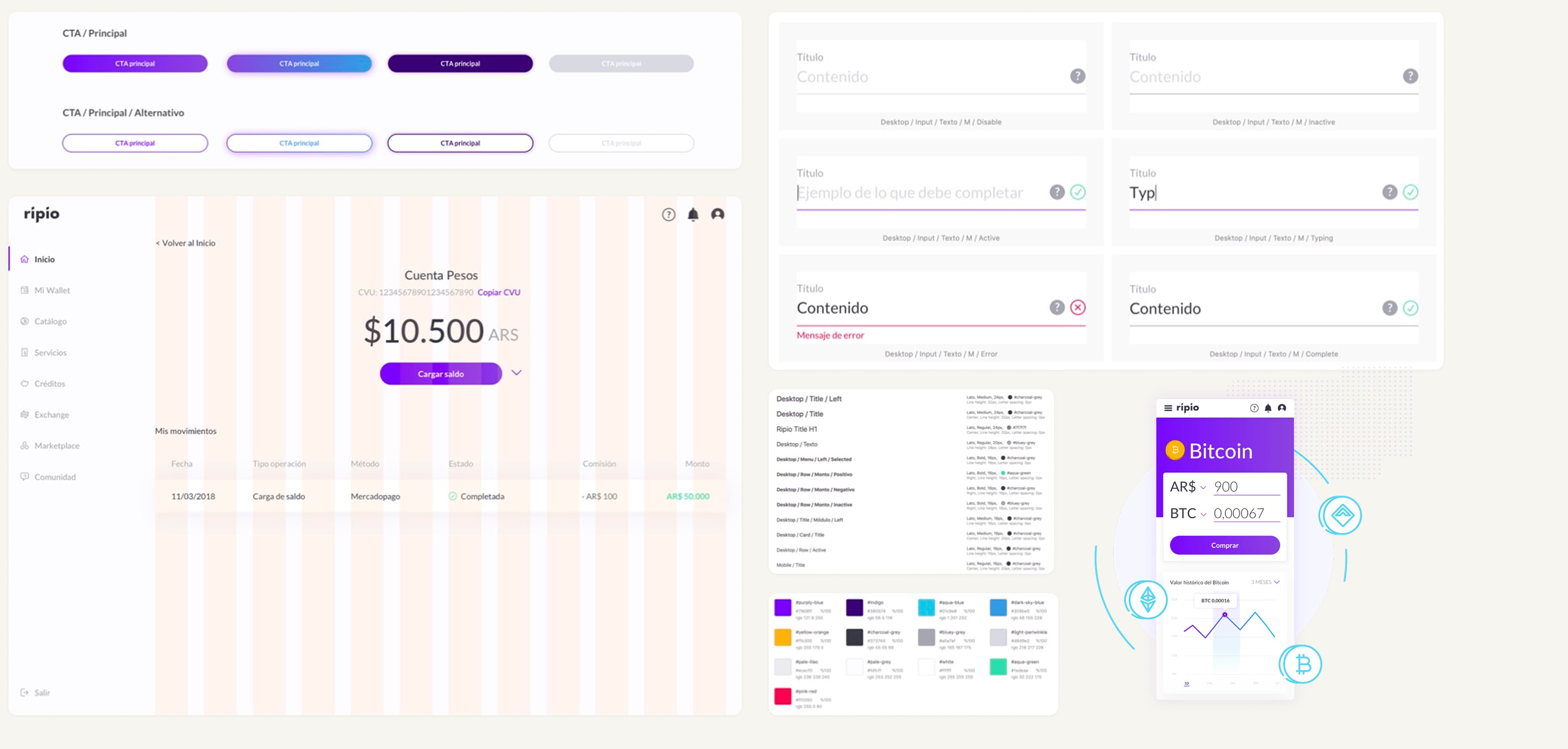
The UI kit covered primary and alternative CTAs with all their states, inputs with icon-based validation (active, typing, error, complete, disabled), a type scale for desktop and mobile, and a palette anchored in Ripio's purple.
With this many flows redesigned in parallel, consistency couldn't depend on memory. We defined the base components and their states first, so every new screen was built from the same parts.
09 — Reflection / Outcome
Reflection / Outcome
Outcome. Everything shipped: the new dashboard, wallet, onboarding and validation, credits, crypto catalog and marketplace.
What I'd do differently
Measure. I handed the project off at launch, so I never saw how the new flows actually performed. Today I'd define success metrics from day one, like activation, validation completion and first purchase, and stay close enough to the launch to learn from them.
Let discovery change the brief. We were hired to prototype a small MVP. Discovery showed that wouldn't solve the real problem, so we made the case for a bigger scope. The most valuable thing I did on this project happened before any screen was designed.
Ripio didn't need another feature for crypto insiders. It needed to feel trustworthy to people who had never bought crypto. That was the bar for every screen I designed.