Catálogo Natura
Millions of women already knew how to shop this way. They just did it on paper.
- Role
- Product Designer
- Timeline
- May – Aug 2019
At a glance
Problem
Natura's catalog, shared by independent vendors, was stuck in print while their customers moved to phones.
What I did
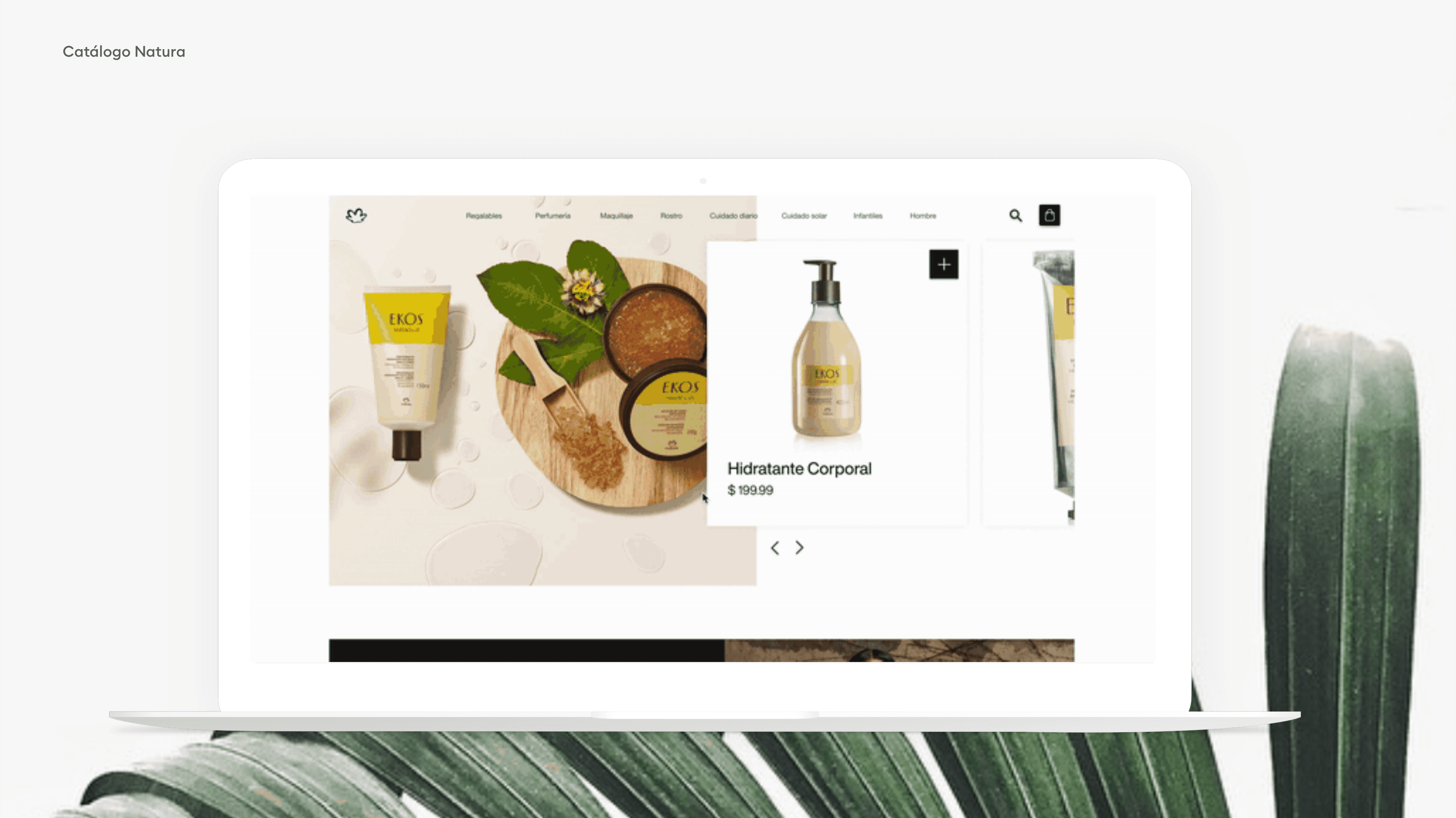
Designed a digital catalog, not an online shop: simple, predictable navigation, a magazine-like visual surface, and QR-code sharing per vendor.
Outcome
Consultoras could share the catalog from their phone and still earn the commission, and Natura's team could load new campaigns without redesigning pages.
01 — Overview
Overview
Natura's catalog is a cultural fixture across South America — sold not through a store, but through a network of independent vendors (consultoras) who share a physical, printed catalog with their customers, page by page, like a magazine. It's intimate, familiar, and it works. The problem: it was stuck in print, while the world moved to phones.
02 — Not an online shop. A digital catalog.
Not an online shop. A digital catalog.
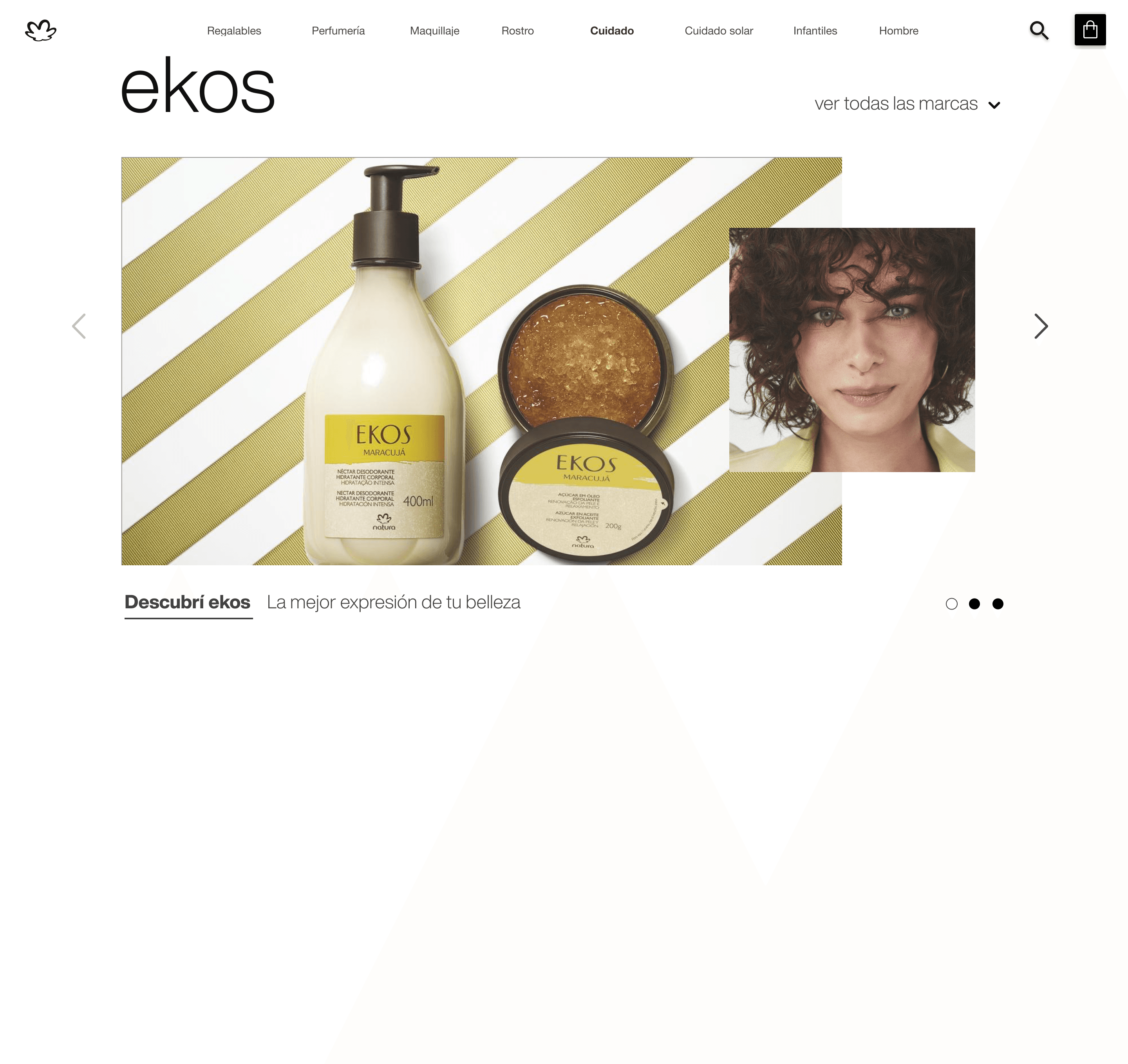
The brief was specific about what this wasn't: not a Shopify-style storefront, not an Amazon-like grid of products. Natura wasn't looking to compete with e-commerce — they already had that. What they needed was something that felt like flipping through the familiar catalog, just on a screen: a consultora could share it with a QR code, a customer could browse it the way they always had, and when they bought something, the consultora who shared it earned the commission.
03 — Designing for people who never asked to "go digital"
Designing for people who never asked to "go digital"
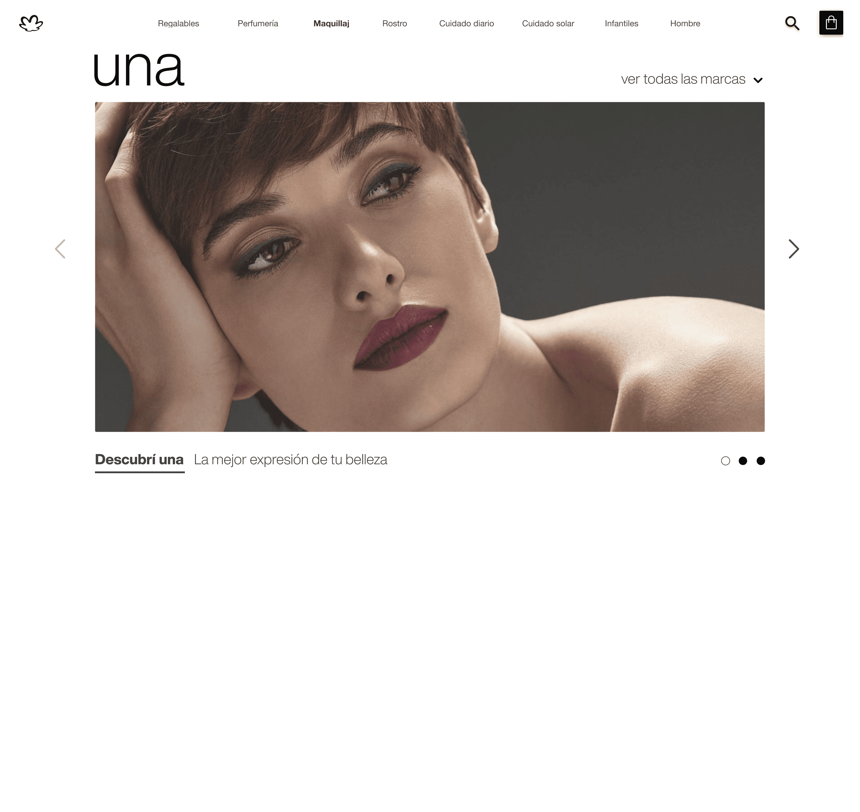
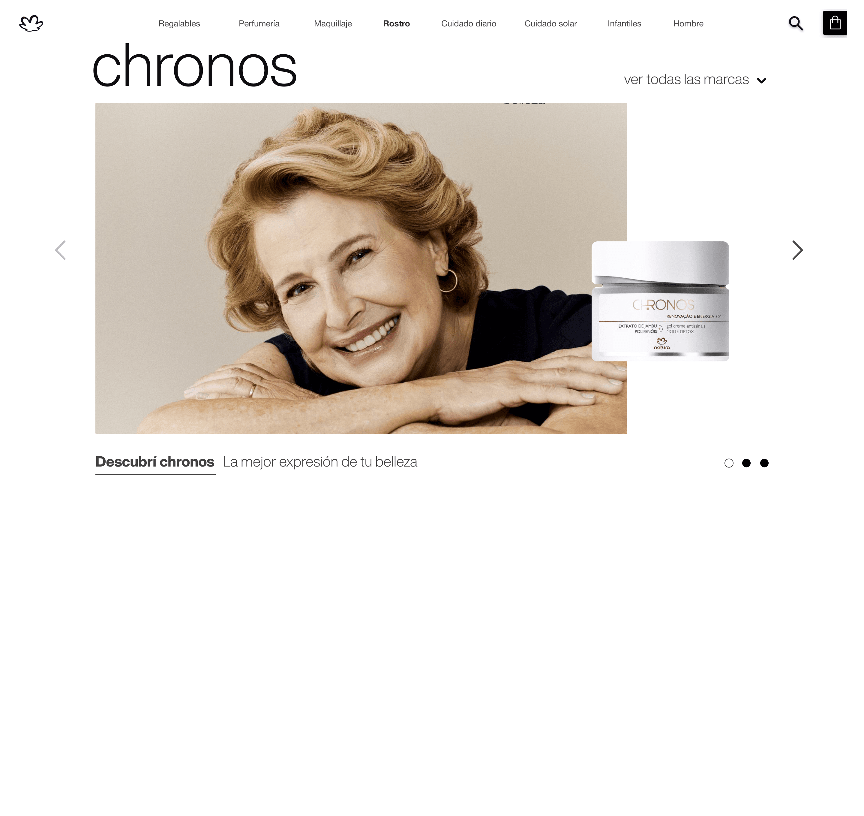
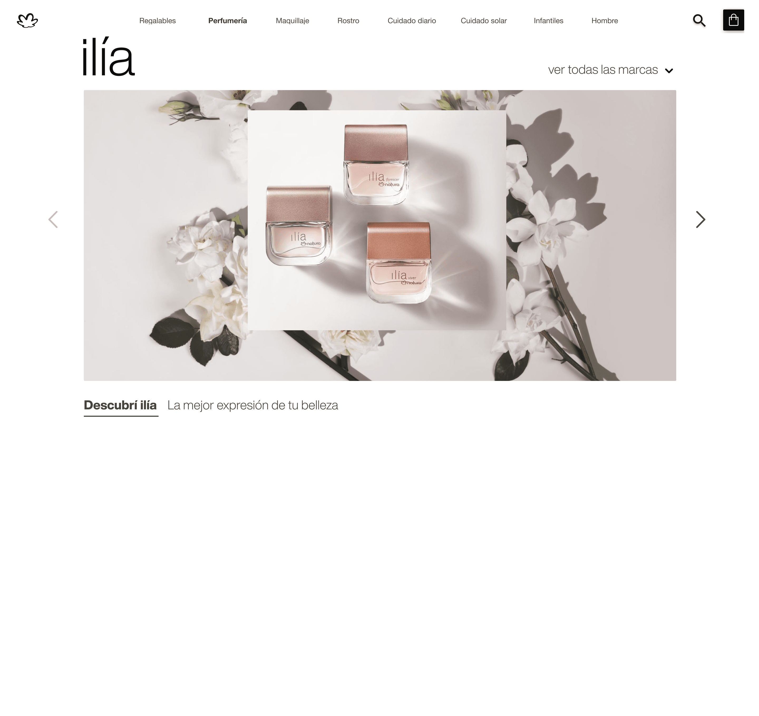
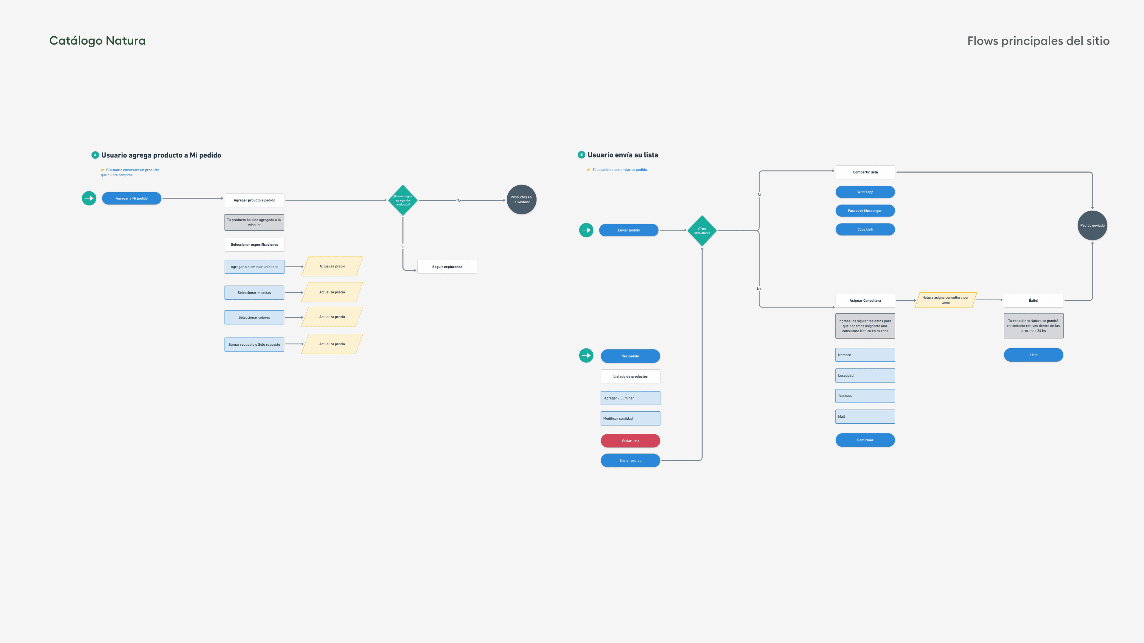
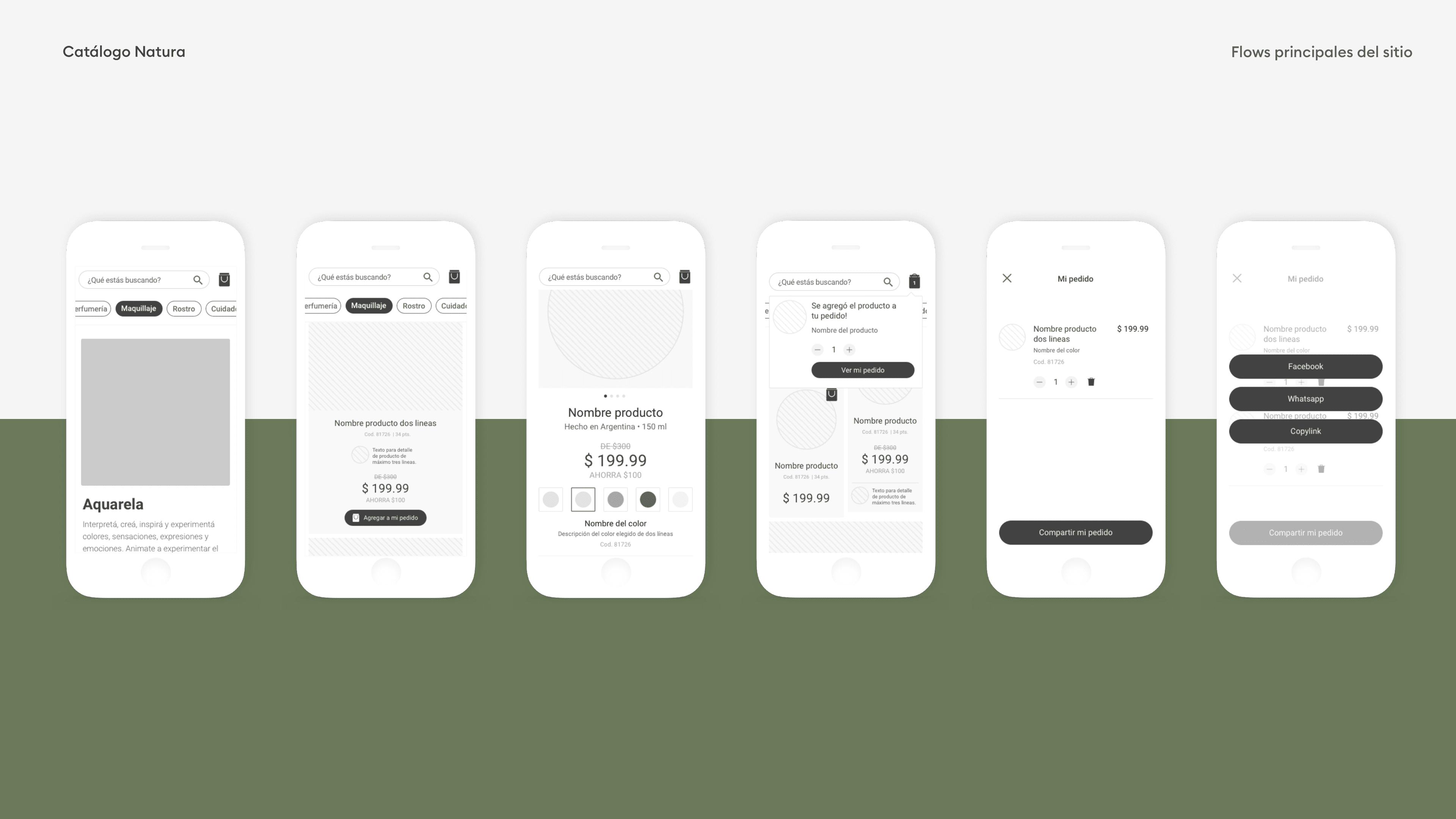
The real challenge wasn't technical, it was emotional: the audience was largely non-tech-savvy, deeply loyal to a ritual that had nothing to do with apps. Get the navigation even slightly confusing, and we'd lose the exact people the brand depended on. So the architecture underneath had to be radically simple — a clear, predictable skeleton anyone could move through without thinking.
04 — But simple skeleton, rich surface
But simple skeleton, rich surface
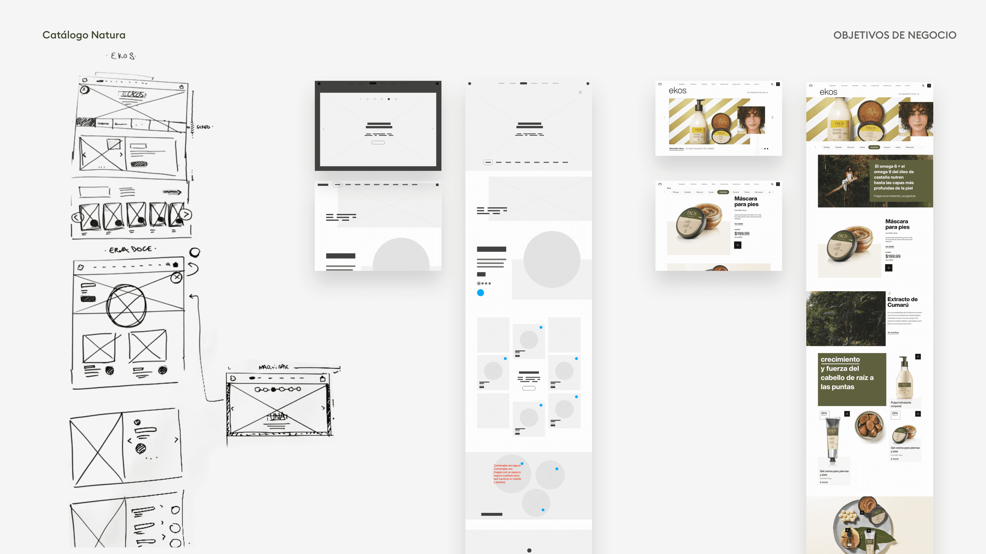
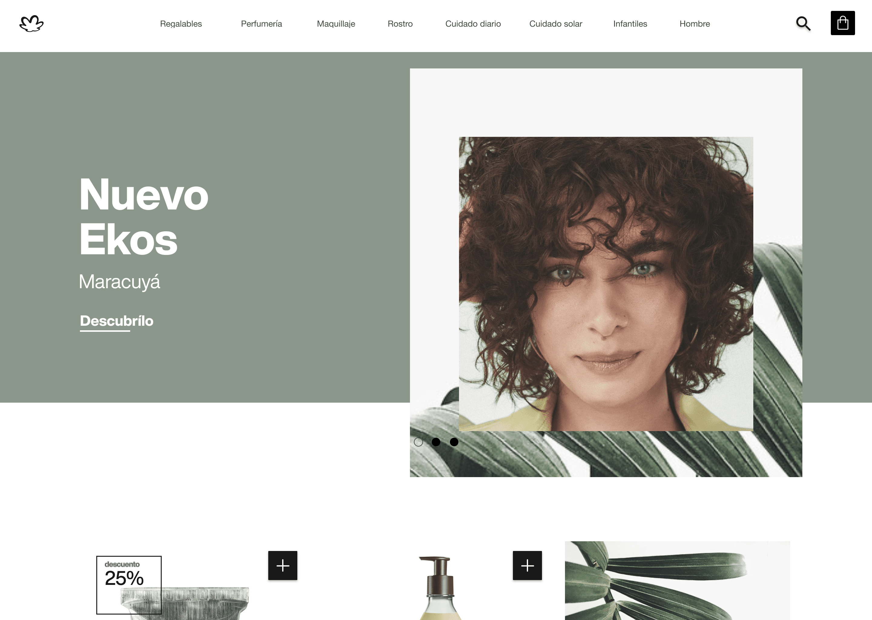
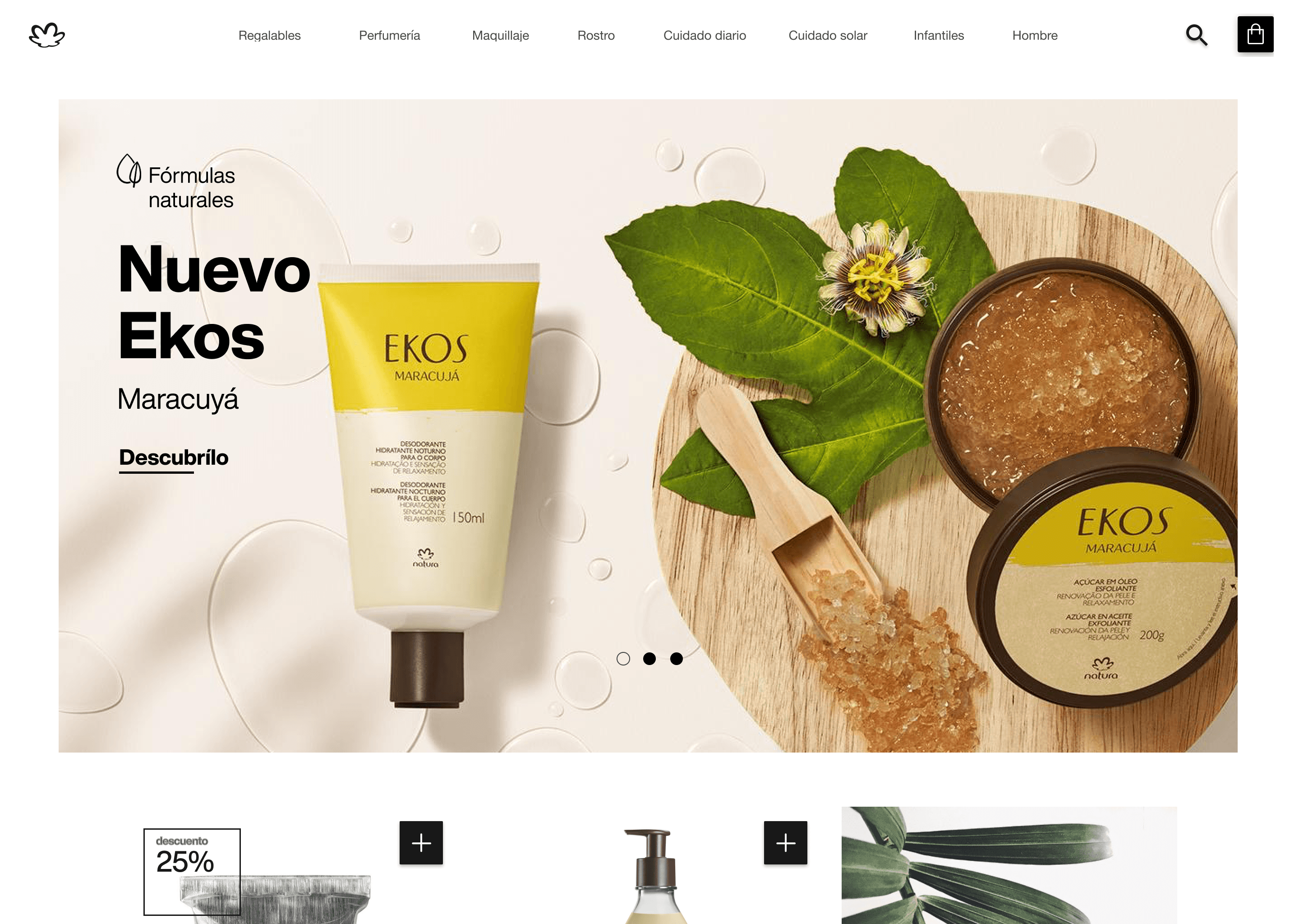
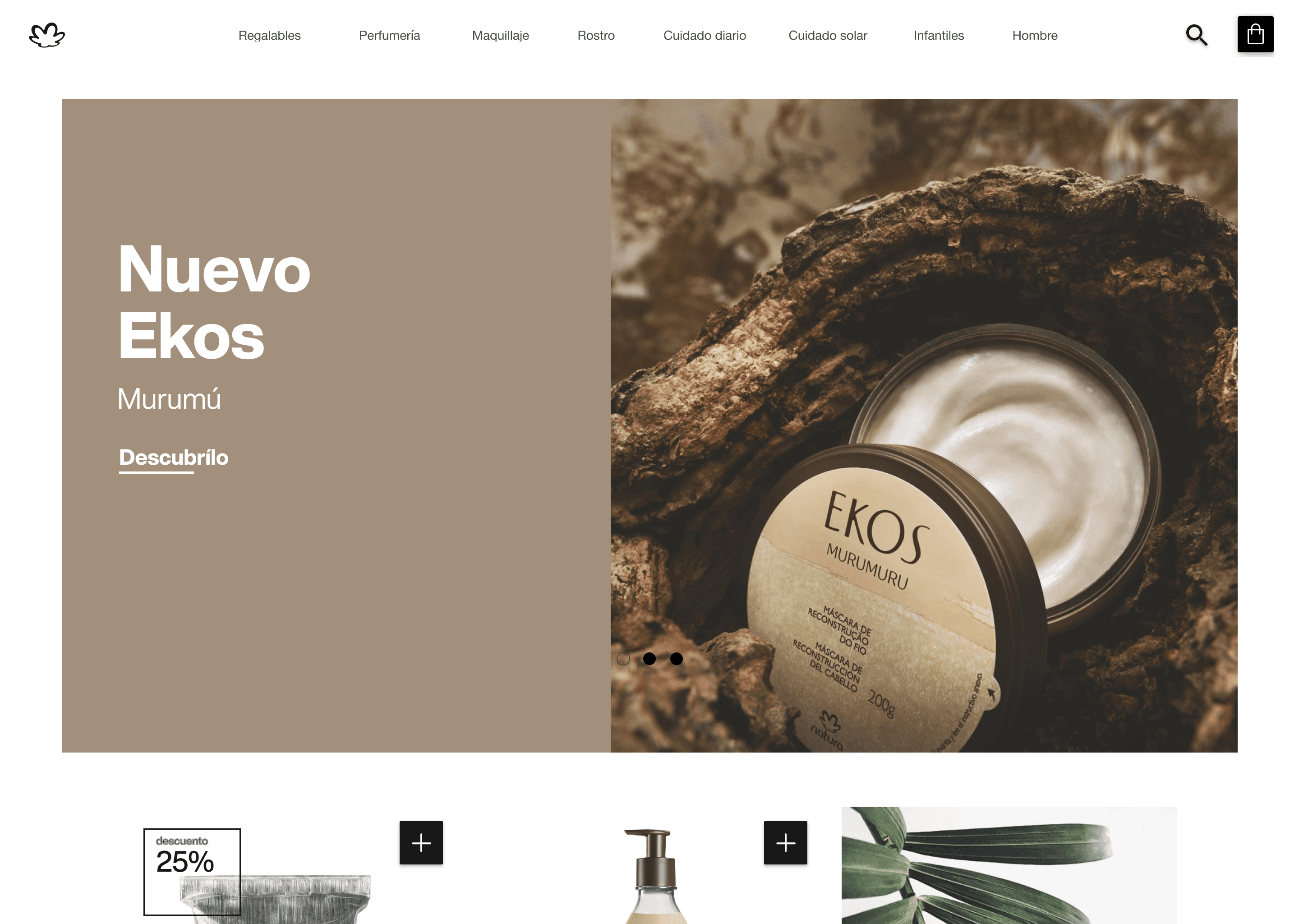
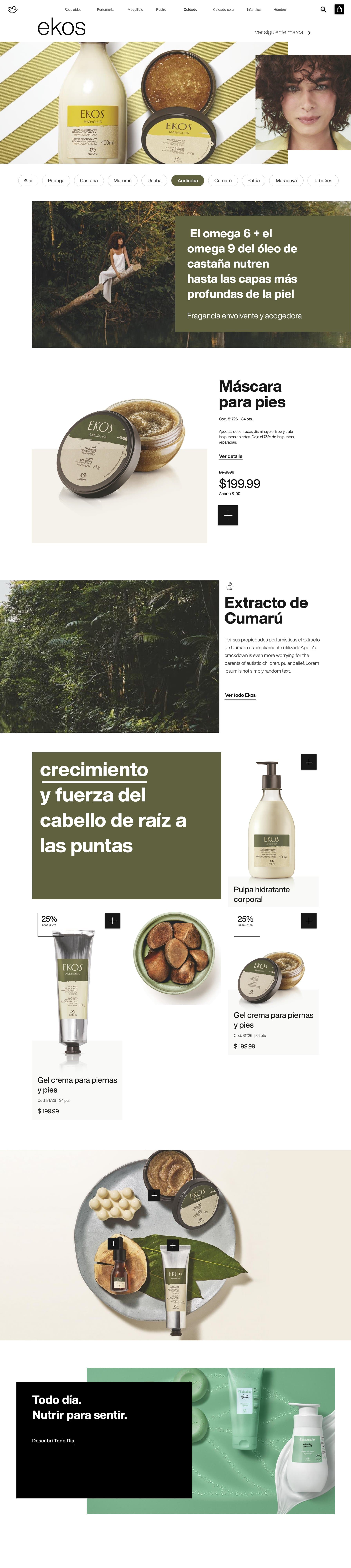
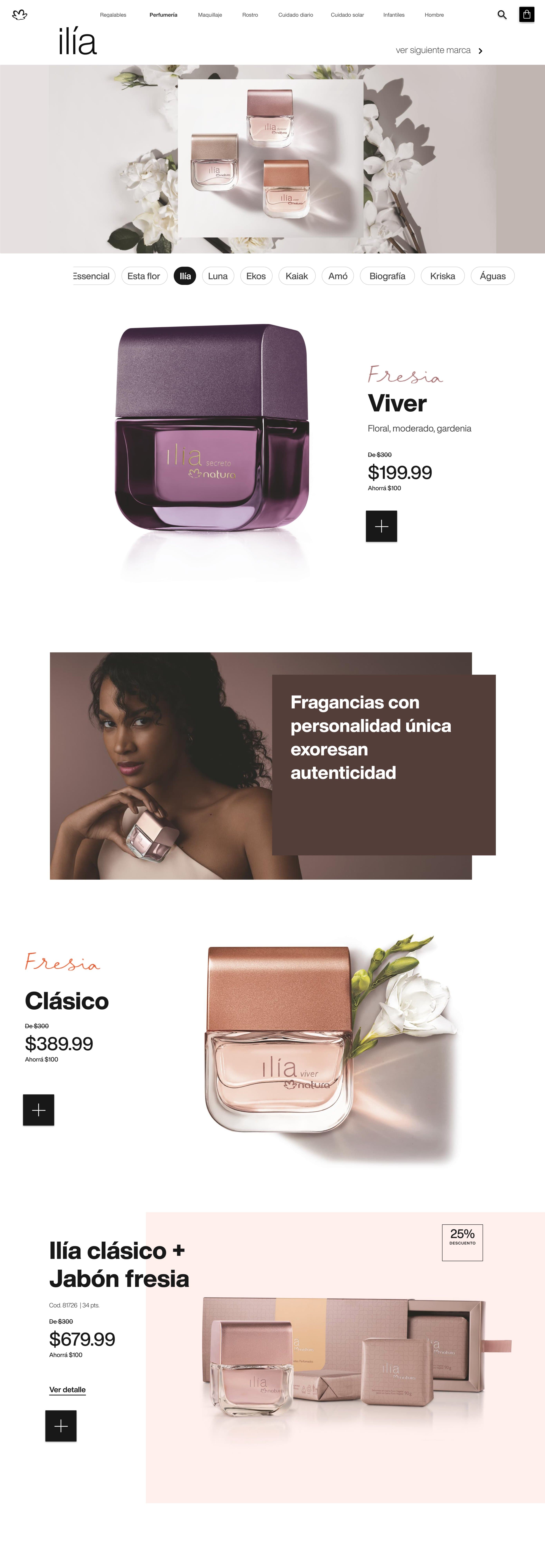
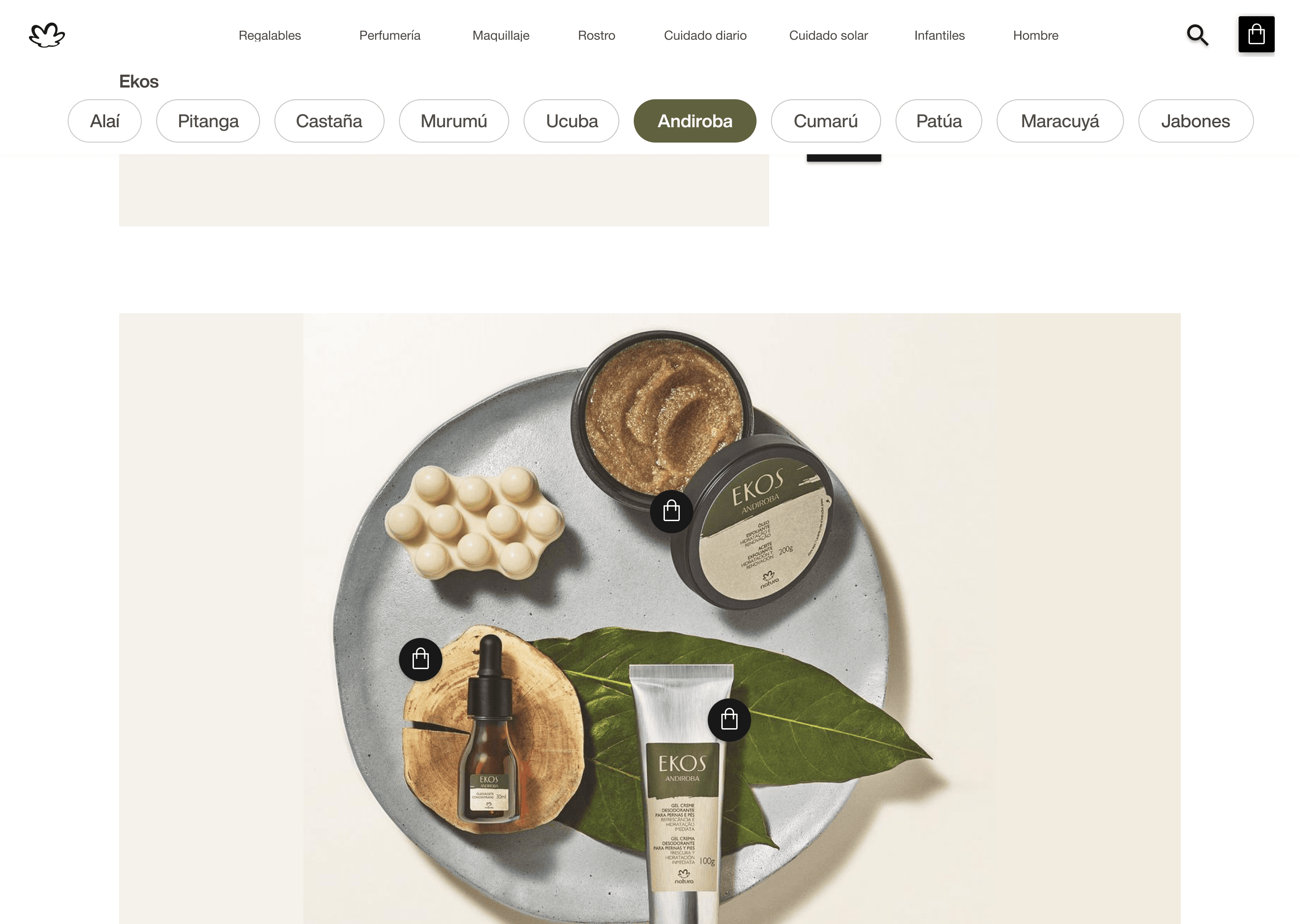
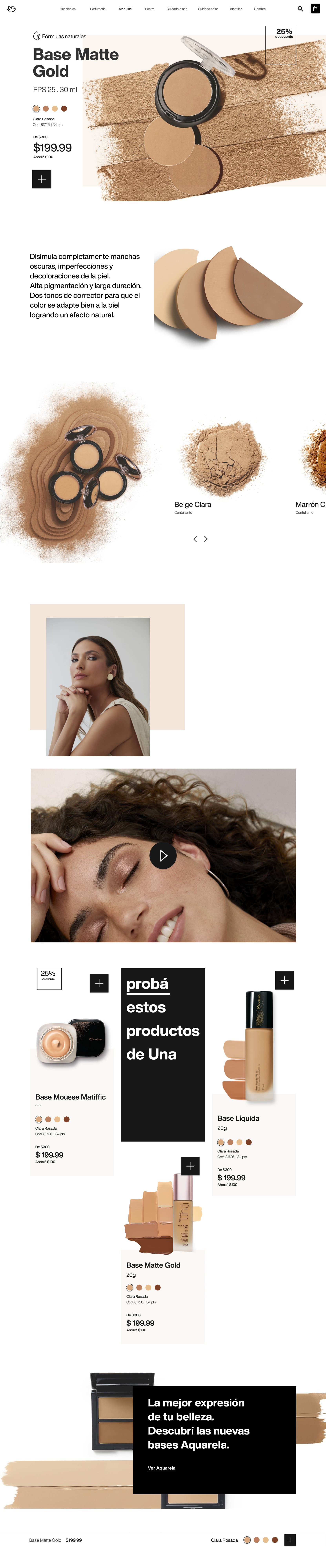
Here's the tension that shaped the whole visual direction: a clean, minimal grid — the instinct for most e-commerce — would have made it feel exactly like the online shop it was explicitly not supposed to be. So once the real content (products, photography) filled that simple skeleton, the surface needed to feel more organic: layered, a little playful, almost collage-like — closer to flipping a glossy magazine page than scrolling a product list.
05 — Built for the business, not just the browse
Built for the business, not just the browse
- Simple, predictable navigation — the strategic foundation that made everything else possible.
- A catalog, not a cart — no marketplace-style browsing; a guided, page-like experience per collection (Ekos, Chronos, Una, Ilía).
- Shareable by design — every catalog instance tied to a vendor via QR code.
- Built for scale — a CMS-driven, reusable component system, so Natura's team could load new campaigns without designers touching every page.


06 — The opportunity
The opportunity
This was never really about "modernizing" a catalog. It was about giving thousands of vendors, and the customers who already trusted them, a way to keep doing something they loved — just with a phone in hand instead of a magazine.